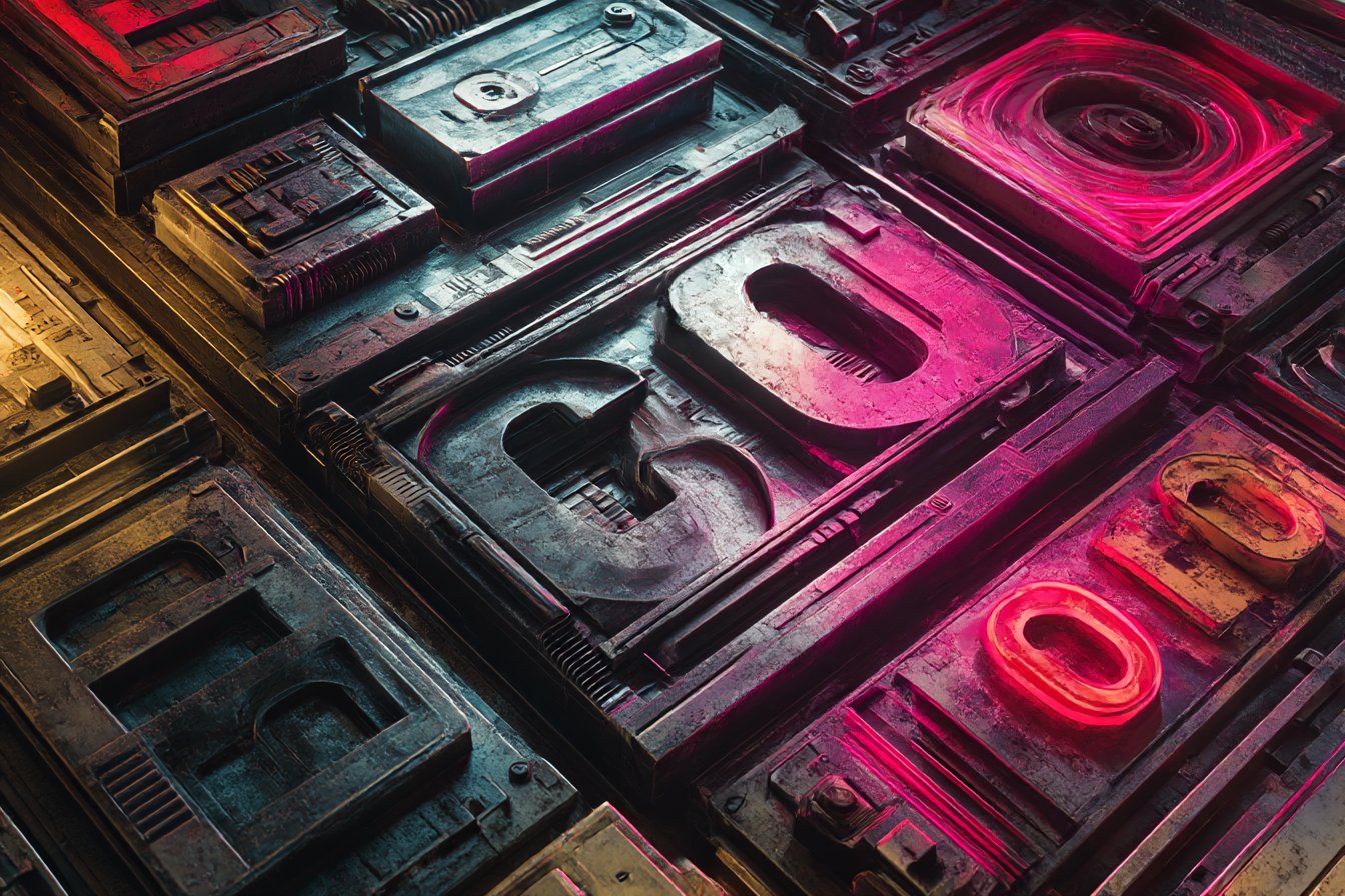

Last month I was tinkering with a mock-up for what a maintenance terminal might look like aboard a generation ship, and I hit a wall that wasn't technical — it was typographical. You know how certain fonts just scream "medieval fantasy" or "elegant wedding invitation"? Well, I needed something that would whisper "reliable technology three hundred years from now," and Times New Roman wasn't cutting it.
The rabbit hole I fell down taught me something crucial: typography in sci-fi isn't just about looking cool (though that matters). It's about creating believability. When someone sees your fictional interface, alien language, or dystopian warning sign, the font choice can either support the illusion or shatter it completely.
I started collecting examples everywhere. Movie screenshots, game interfaces, book covers, even those cheesy "DANGER: RADIATION" signs you see in B-movies.

What I noticed was fascinating — the most convincing futuristic typography often broke rules we take for granted about readability and convention.
Take Eurostile, for instance. This chunky, geometric sans-serif from the 1960s has become the unofficial font of "near-future corporate." You've seen it in countless films without realizing it. Stanley Kubrick used it in 2001: A Space Odyssey for HAL's displays, and it's been shorthand for "advanced but trustworthy technology" ever since. There's something about those squared-off curves that suggests precision engineering without being sterile.
But here's where it gets interesting — sometimes the "wrong" choice works brilliantly. I remember watching Blade Runner again recently and noticing how the film mixes ultra-futuristic elements with deliberately retro typography. Those neon signs in multiple languages? They use fonts that feel like they could exist today, which makes the world feel lived-in rather than designed yesterday. The future, the movie suggests, doesn't throw away everything that came before.

For my own projects, I've started building a sort of mental taxonomy. Clean, geometric fonts like Orbitron or Exo work beautifully for interfaces that need to feel advanced but user-friendly — think benevolent AI or medical equipment. The letterforms are distinctive enough to feel "designed" but readable enough for actual use.
When I need something more unsettling, I reach for fonts that break expected proportions. Stranger Things popularized that chunky, angular look with ITC Benguiat, but there are subtler options. Fonts with slightly off kerning or unusual weight distribution create subconscious unease. Your brain knows something's not quite right, even if it can't pinpoint what.
Alien languages present their own challenge entirely. I spent weeks trying to create convincing glyphs for a story about archaeologists discovering non-human writing. The temptation is to make everything incredibly ornate and complex, but that assumes alien minds would value the same aesthetic flourishes we do. Some of my most successful attempts were brutally simple — geometric shapes that suggested logic systems rather than artistic expression.
You Might Also Like

The real trick, I've learned, is thinking about context. A font that works perfectly for a sleek starship interface might feel ridiculous on a gritty space station. Military displays should feel different from civilian ones. Corporate signage in a dystopian future would probably look sterile and oppressive, while underground resistance communications might use deliberately crude, hand-drawn aesthetics.
I made this mistake once while designing propaganda posters for a fictional authoritarian regime. I chose this beautiful, flowing serif that looked elegant and sophisticated. My sister (yes, the same one who teased me about my notebook) took one look and said, "That looks like a spa brochure, not fascist propaganda." She was absolutely right. Authoritarian typography tends to be bold, imposing, sometimes deliberately harsh. Think of those stark, angular fonts used in wartime posters or brutalist architecture.
Color plays a huge role too, though that's beyond pure typography. Still, when I'm choosing fonts for sci-fi projects, I'm always thinking about how they'll look in different lighting conditions. Will this text be readable on a flickering monitor? How does it look when projected as a hologram? These aren't just aesthetic questions — they affect the believability of your fictional world.
Free resources have been a lifesaver for my experiments. Google Fonts has several excellent sci-fi options, and sites like DaFont have entire categories dedicated to futuristic and techno styles. Just be careful about licensing if you're using fonts commercially.

I learned this the hard way when I had to redesign an entire project because the perfect font I'd found had restrictive licensing terms.

One technique I particularly love is mixing font weights and styles within the same interface. Real-world software does this constantly — bold headers, regular body text, light captions. But in sci-fi, you can push this further. Maybe alien technology uses three different text weights to indicate different types of information, or priority levels are shown through typography alone.
The key is consistency within your fictional world. If you establish that military systems use one typeface and civilian systems use another, stick to that logic. Readers (or viewers) will unconsciously pick up on these patterns, and consistency helps them navigate your fictional world more intuitively.
Sometimes I test my choices by showing them to friends without context. "What does this text make you think of?" If they say "bank website" when I was going for "post-apocalyptic survivor community," I know I've missed the mark.
Typography in science fiction is really about translation — taking contemporary visual language and stretching it toward futures that feel plausible, whether hopeful, terrifying, or strange. The best sci-fi fonts don't just look cool; they support the story you're trying to tell and the world you're trying to build. They're invisible storytellers, working quietly to make the impossible feel inevitable.

0 Comments